
Radio
A Radio field shows a list of options on the form. The client chooses one option, or several when Multi select is on. It is available in HTML and PDF templates.
A new Radio is not required, and both the client and the agent can edit it. For the settings that all fields share, such as the label, the permissions and the dependencies, see Field settings. For a drop-down list, or for options from a dictionary, use a List Of Values.
Options
Section titled “Options”Set the options on the Values & Display tab. Click Add item to add an option. Each option is a row in the table:
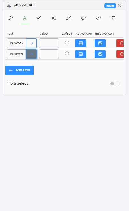
| Column | What it does |
|---|---|
| Text | The text of the option, shown to the client. Click the arrow button next to it (Copy label to value) to copy the text into Value. |
| Value | The value that is saved when the client chooses the option. A value can’t contain a comma. |
| Default | The option that is chosen when the form opens. You can select one default option. |
| Active icon, Inactive icon | The icon shown for the option when it is chosen and when it is not. See Option icons. |
| Trash icon | Removes the option. |
Turn on Multi select to let the client choose several options. The options are shown as checkboxes, and the field’s value is the chosen values, separated by commas.
Two options with the same value, or a value with a comma, are reported as warnings on the Issues tab. See Issues.
Option icons
Section titled “Option icons”- Click the button in the Active icon or Inactive icon column of the option. Select Icon opens.
- Do one of these:
- Find an icon with Search Icons and click it. Set its Font Color and Size.
- Under Icon, upload an image: PNG, JPG, GIF, SVG or WEBP. Set its Width and Height.
- To use the same icon for all the options, select Apply to all values.
- Click Save.
To remove an icon, open it and click Delete.
Set both an active and an inactive icon. The form shows icons for an option only when it has both.
The Style tab of a Radio field has two more settings:
| Setting | What it does |
|---|---|
| Widget types | Radio (the default), or Rating: when the client chooses an option, the option and all the options before it are highlighted. |
| Display buttons | Shows the options as a list of buttons. |
In a PDF template
Section titled “In a PDF template”In a PDF template, each option is a separate circle on the page. Drag each circle to its place. A new option is placed next to the last one. Radio circles can’t be resized. See Radio buttons.
Conditions
Section titled “Conditions”In conditions, a Radio field supports Equal, Not Equal, Empty and Not Empty. With Multi select, it supports Contains, Not Contains, Empty and Not Empty. You select the value from the field’s options.