
Workflow editor
תוכן זה אינו זמין עדיין בשפה שלך.
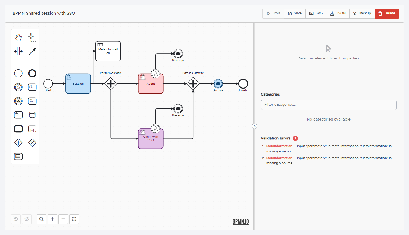
The workflow editor opens when you create a workflow or open one from the workflows list. It has four parts:
- the toolbar at the top, with the workflow name and the main actions;
- the palette at the left, with the tools and the elements you can add;
- the canvas in the middle, where you draw the diagram, with the undo and zoom controls at the bottom left;
- the properties panel at the right, where you set up the selected element.
The toolbar
Section titled “The toolbar”Enter the workflow name at the left of the toolbar. An asterisk (*) next to the name means that the workflow has unsaved changes. Changes are not saved automatically, so save before you leave the editor.
| Button | What it does |
|---|---|
| Start | Starts a process from the start event selected on the canvas. See Start a process. |
| Save | Saves the workflow. A new workflow gets its own address when it’s saved for the first time. |
| SVG | Downloads an image of the diagram (.svg). |
| JSON | Downloads the workflow as a .json file, which you can import into another project or server. |
| Backup | Downloads a .cellosign file with the workflow and the objects it uses, such as templates and dictionaries. Shown only when process backup is included in your organization’s plan. Save the workflow before you back it up. |
| Delete | Deletes the workflow after you confirm. This can’t be undone. Not shown for a workflow that was never saved. |
The palette
Section titled “The palette”| Group | Items |
|---|---|
| Tools | Hand tool (move the whole diagram), Lasso tool (select several elements), Create/remove space tool (push elements apart or pull them together), Global connect tool (draw a connection between two elements). |
| Events | Start Event, End Event, Signal (Wait) |
| Activities | Form / Session, Message (Email/SMS), Script Task, Web Service, Database Task, Call Activity, Sub Process |
| Gateways | Parallel Gateway, Exclusive Gateway (XOR) |
| Artifacts | Meta Information |
To add an element, drag it from the palette to the canvas, or click it and then click the canvas.
Build the diagram
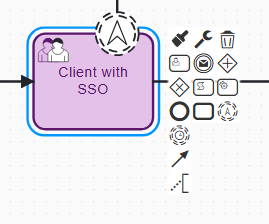
Section titled “Build the diagram”Click an element on the canvas to open its menu of quick actions next to it:
| Action | What it does |
|---|---|
| Append form, Append message, Append parallel gateway, Append exclusive gateway, Append script, Append service, Append call activity, Append finish event | Adds a new element after the selected one. The new element follows the pointer: click where you want to place it. It’s connected to the selected element. |
| Append form created event, Append form expired event | Shown on a Form / Session. Attaches an event that starts a separate path when the form is created or when it expires. See Form events. |
| Connect using sequence flow | Draws a connection from the selected element to another element. |
| Add text annotation | Adds a note to the diagram. Notes don’t affect the process. |
| Collapse subprocess / Expand subprocess | Shown on a Sub Process. Hides or shows its contents. |
| Change type | Changes the element to a related type, for example a regular end event to a failed end event. On a Form / Session, use Shared Form to turn it into a shared form. |
| Change color | Changes the color of the element on the canvas. |
| Remove | Deletes the element. |
An end event has only Change type, Change color and Remove, because nothing can follow it.
For example, to add a form after another one: select the form, click Append form, click where to place the new form, and enter its Name in the properties panel.
Click a connection to set it up, for example to give it a condition after an exclusive gateway. See Gateways and conditions.
The controls at the bottom left of the canvas are Undo, Redo, Reset zoom, Zoom in, Zoom out and Fit to viewport.
The properties panel
Section titled “The properties panel”Select an element to see its settings in the properties panel. Every element has a read-only ID (click it to copy it) and a Name, which is shown on the canvas. Most elements also have an Inputs tab, where you choose the data the element receives from earlier elements. See Inputs and data.
To make the panel wider or narrower, drag its left edge. To hide it, click the arrow button on its edge.
When no element is selected, the panel shows:
- Categories: select the categories of the workflow. Shown only when categories are included in your organization’s plan.
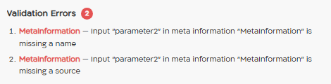
- Validation Errors: the problems found in the workflow. See Validation errors.
Validation errors
Section titled “Validation errors”The editor checks the workflow when it opens, every time you change it, and when you save it. To see the problems it finds, click an empty area of the canvas: they are listed under Validation Errors, with the number of errors. If there are no problems, the list shows “No validation errors”.
Each error shows the element’s name and the problem, for example “Message “Invite client” requires an email subject“. Click an error to select the element and show it on the canvas.
The workflow is saved even if it has validation errors, but a process may fail or get wrong data when it reaches an element with an error. Fix the errors before you start processes. Some problems, such as mistakes in JavaScript code, can’t be found by the editor; test the workflow by starting a process.
The pages of the elements list the problems the editor checks for each element.
Start a process
Section titled “Start a process”To test a workflow, you can start a process from the editor:
- Save the workflow. Start is not available while there are unsaved changes.
- On the canvas, select the start event to start from.
- Click Start.
- If the start event has inputs, the Start Workflow dialog opens. Enter the values, and click Start. Required inputs are marked with an asterisk, and values in the wrong format, such as an invalid email address, are marked in red.
The process starts, and its page opens in a new browser tab.