
Radio
תוכן זה אינו זמין עדיין בשפה שלך.
Values & Display
Section titled “Values & Display”
| Text | Title for the radio button that will be shown in the form. |
| Value | Value of the radio button. *Comma separator value is not allowed. |
| Default value | Default radio button that will be selected upon sending the form. |
| Active icon | The icon that the user will see in the form when the radio is selected. In addition it is possible to define the color of the icon. |
| Inactive icon | The icon that the user will see in the form when the radio is unselected. In addition it is possible to define the color of the icon. |
| Delete [x] | Delete the selected row. |
| Multi select | When selected the user will be able to choose more than one radio button in the form. *If Multi select check box is marked icons will be ignored. |
See below the example of radio buttons with icons:

Conditional Permissions
Section titled “Conditional Permissions”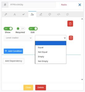
When checking conditions on a radio type controller, the following options are displayed:
| Equal | If the radio controller is exactly equal to the entered value. |
| Not Equal | If the radio controller is not equal to the entered value. |
| Empty | If the radio controller has no value. |
| Not Empty | If there is any value in the radio controller. |

| Widget types | For rating radio buttons set the type to “Rating”. Default: None |
| Inline Block | When selected the radio buttons will be lined up. |
| Display buttons | When selected the radio buttons will be displayed as list of buttons |
See below the example of radio buttons with “Rating” widget type and “Inline Block” selected:
